Aim
The aim of this project was explore any patterns or relationships between types of international customers based on a publicly available dataset.
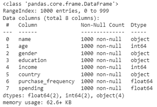
There are 8 columns of data in this dataframe. There are zero null values, and the data types look appropriate for most analyses, so no obvious data cleaning or transformation required at this point.
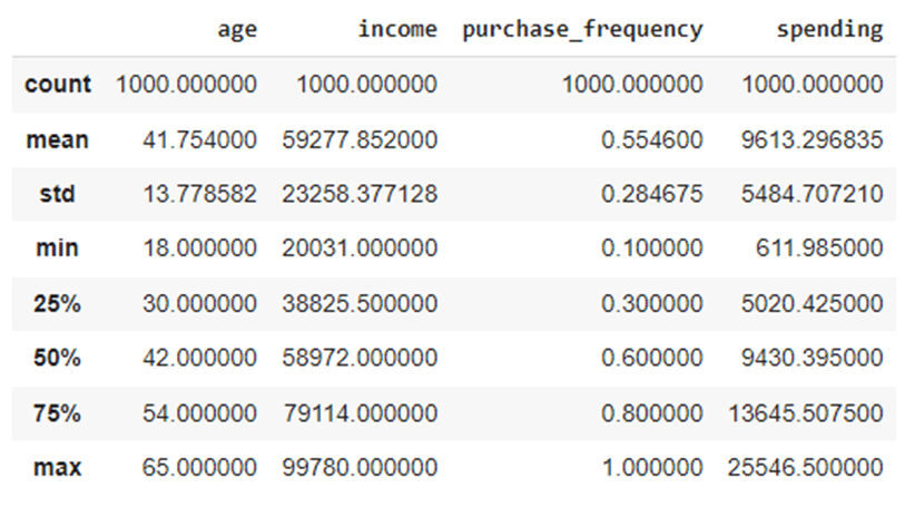
Next, I continued to use pandas to get quick overview of our data including the number of unique values in each category:


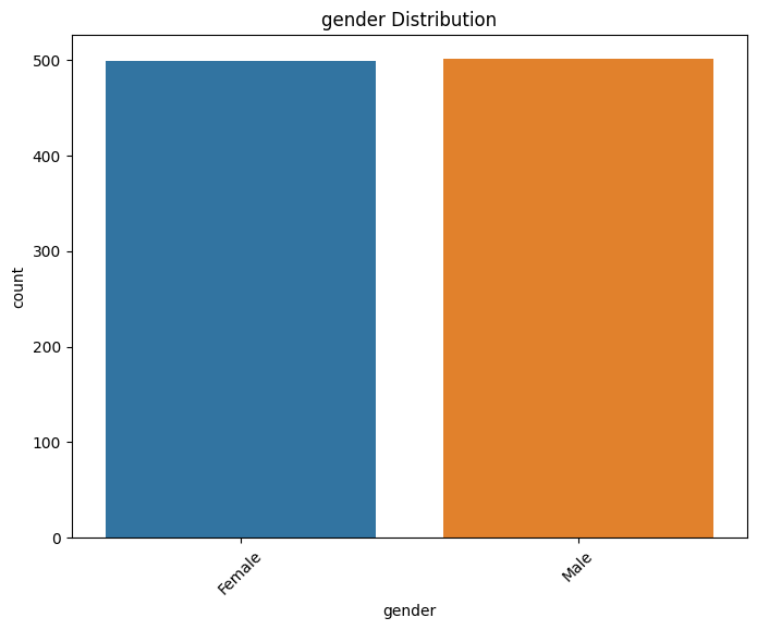
I wanted to check the distribution of the nominal categories: “gender” and “education” to see if the numbers of values in each category made them comparable. Note that there are a lot of countries represented in this relatively small dataset.
View code:
import pandas as pd
import matplotlib.pyplot as plt
import seaborn as sns
nominal_columns = ['gender', 'education']
# Iterate over the nominal columns
for column in nominal_columns:
    # Calculate value counts
    value_counts = df[column].value_counts()
    # Create a DataFrame with the counts
    counts_df = pd.DataFrame({column: value_counts.index, 'Count': value_counts.values})
    # Display the table
    print(f"Distribution of {column}:")
    print(counts_df)
    print()
    # Plot the distribution
    plt.figure(figsize=(8, 6))
    sns.countplot(x=column, data=df)
    plt.title(f"{column} Distribution")
    plt.xticks(rotation=45)
    plt.show()

View code:
import seaborn as sns
import matplotlib.pyplot as plt
# Assuming you have a DataFrame named 'df' with columns 'gender' and 'education'
# Count the number of occurrences of each gender within each education category
gender_education_counts = df.groupby(['education', 'gender']).size().unstack()
# Normalize the counts to get proportions instead of counts
gender_education_proportions = gender_education_counts.div(gender_education_counts.sum(axis=1), axis=0)
# Reset the index to make 'education' a regular column
gender_education_proportions = gender_education_proportions.reset_index()
# Melt the DataFrame to convert columns to categorical variables
gender_education_melted = pd.melt(gender_education_proportions, id_vars='education', var_name='gender', value_name='proportion')
# Plot the bar chart
plt.figure(figsize=(10, 6))
sns.barplot(data=gender_education_melted, x='education', y='proportion', hue='gender')
plt.title('Gender Distribution within Education Categories')
plt.xlabel('Education')
plt.ylabel('Proportion')
plt.legend(title='Gender')
plt.show()

This bar chart made it clear that the nominal values in this dataset are very evenly distributed which meant I could start straight away with the analysis.
Analysis
To begin I wanted to take a look at how gender and education influence income and spending using Seaborn heatmaps visualisations.
View code:
import seaborn as sns
import pandas as pd
import matplotlib.pyplot as plt
education_order = ['High School', 'Bachelor', 'Master', 'PhD']
# Convert the 'education' column to a categorical data type with the desired order
df['education'] = pd.Categorical(df['education'], categories=education_order, ordered=True)
# Assuming you have a DataFrame named 'df' with columns 'gender', 'education', 'income', and 'spending'
# Create a contingency table
contingency_table = pd.crosstab(df['gender'], df['education'], values=df['income'], aggfunc='mean')
# Create the heatmap
plt.figure(figsize=(10, 6))
sns.heatmap(contingency_table, annot=True, cmap='YlGnBu', fmt='.1f')
plt.title('Heatmap of gender vs education (income)')
plt.xlabel('Education')
plt.ylabel('Gender')
plt.show()
# Create another contingency table for spending
contingency_table_spending = pd.crosstab(df['gender'], df['education'], values=df['spending'], aggfunc='mean')
# Create the heatmap for spending
plt.figure(figsize=(10, 6))
sns.heatmap(contingency_table_spending, annot=True, cmap='YlGnBu', fmt='.1f')
plt.title('Heatmap of gender vs education (spending)')
plt.xlabel('Education')
plt.ylabel('Gender')
plt.show()

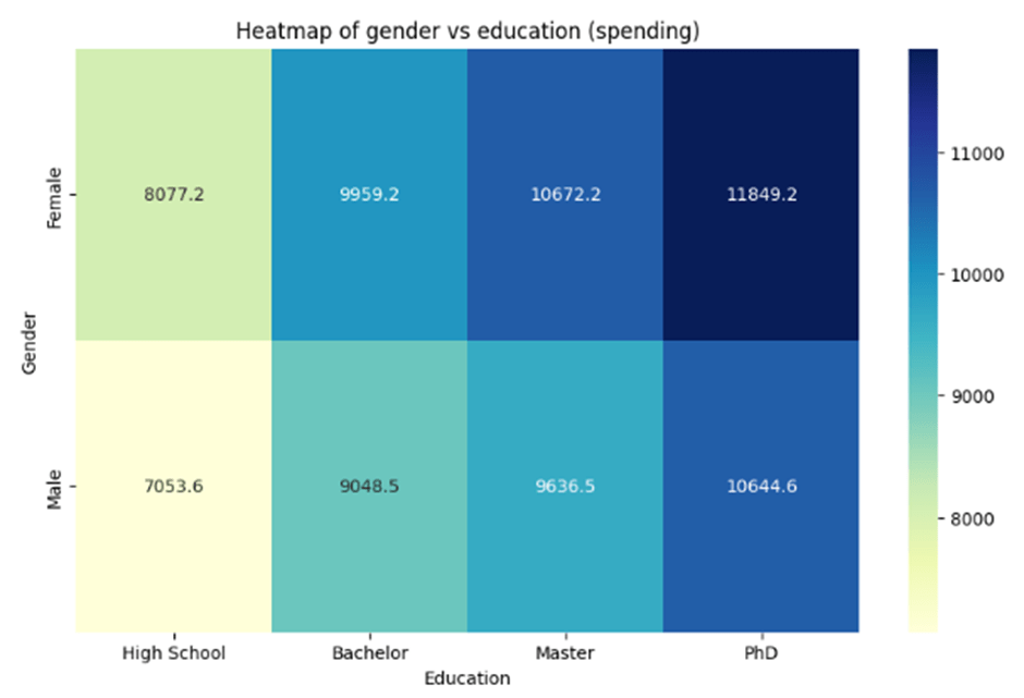
From these heatmaps we can see that males with a high school education are spending the least (mean=7053.6) , and females with a PhD are spending the most (11849.2). This cannot be explained by income alone, because we see that males with a high school education are earning more than females with a PhD. We could speculate that females with a PhD may be more involved in household and/or parental duties and are less frequently in full-time work compared to high school level education males, but we can also see from the heatmaps that males with a PhD are earning less than females with a PhD, so the underlying reasons seem to be less obvious.
Could it be that women are more likely to have a PhD in countries which pay higher salaries, and males with a PhD are more highly represented in countries which pay lower salaries compared to females?
To answer this question we will need to look beyond our dataset. Using the data from https://www.worldometers.info/gdp/gdp-by-country/ we can append a GDP column to our dataset and get a very rough idea of whether there is an obvious case for an influence of GDP per capita on PhD salary between the two groups.
View code:
# Set the figure size
plt.figure(figsize=(18, 6))

# Create a custom color palette using the 'GDP' values
custom_palette = sns.color_palette("viridis", len(gdp_data['GDP']))

# Create the bar plot with the custom color palette
sns.barplot(x='country', y='GDP', data=gdp_data, palette=custom_palette)

# Rotate the x-axis labels for better visibility if needed
plt.xticks(rotation=90)

# Set the axis labels and plot title
plt.xlabel('Country')
plt.ylabel('GDP')
plt.title('GDP by Country')

# Show the plot
plt.show()

# Calculate the median GDP value
median_gdp = df['GDP'].median()

# Create a new column 'GDP_category' based on the GDP value compared to the median
df['GDP_category'] = ['Low' if gdp < median_gdp else 'High' for gdp in df['GDP']]

# Filter the DataFrame to include only females and males with PhDs
female_phd = df[(df['gender'] == 'Female') & (df['education'] == 'PhD')]
male_phd = df[(df['gender'] == 'Male') & (df['education'] == 'PhD')]

# Group by 'GDP_category' and 'gender' and calculate the proportions
female_proportions = female_phd.groupby('GDP_category').size() / len(female_phd)
male_proportions = male_phd.groupby('GDP_category').size() / len(male_phd)

# Print the proportions
print("Proportions of Females with PhDs:")
print(female_proportions)
print("\nProportions of Males with PhDs:")
print(male_proportions)

The output shows that there is no significance difference between the proportion of females with PhDs from high/low GDP countries and the proportion of males with PhDs from high/low GDP countries. The fact that women with PhDs are earning more than men with PhDs is not explained by the country data. As I did not know much about the origin of this dataset, it does not seem fruitful to speculate on the findings of this analysis, as this dataset could have been generated for practice purposes only.
I continued by taking a look at how income and spending vary between education groups, and age groups.
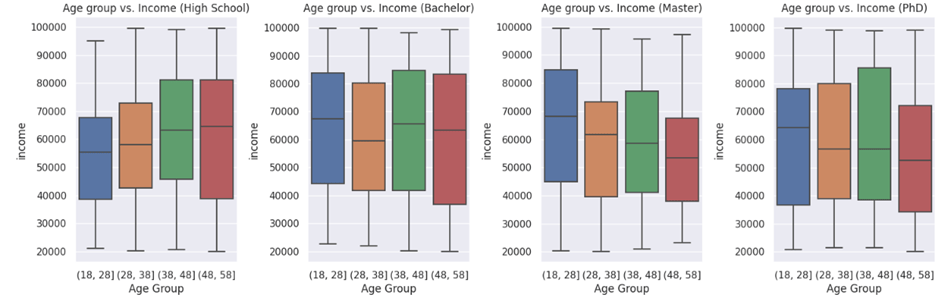
There was no clear relationship between the spending of different age groups within education categories.
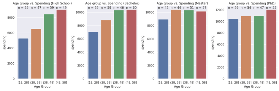
On the other hand, spending seemed to increase with age in 3 of the 4 education groups.
I finished this analysis by separating countries into continents using the pycountry package.
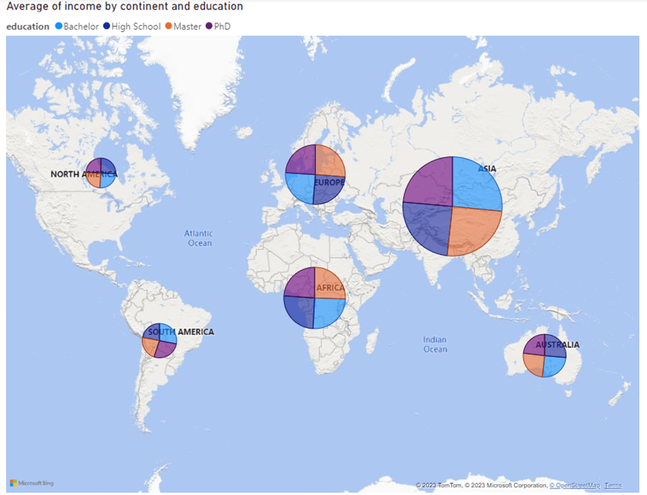
The size of the data point representing the average income for those individuals in our dataset from a particular continent. The data points are also set up as Piecharts, showing the distribution of education levels within each country.
This was a nice project to explore and practice the use of python packages; pandas, matplotlib, seaborn, pycountry and Microsoft Power BI to provide different types of visuals to a novel dataset. It would have been nice to know more about the origins of this particular dataset, as there are some unexpected results (females with PhD earning more than males on average). There was also an extraordinary distribution of very well balanced data between 239 countries and the 4 education levels. It seems likely that the data has been generated for data analysis practice purposes and to that end it was nice, but I would be very cautious about suggesting it provides any real-world insights (which would have made the outcomes much more interesting!).
